

Webgold Introduces Its New Brand Identity
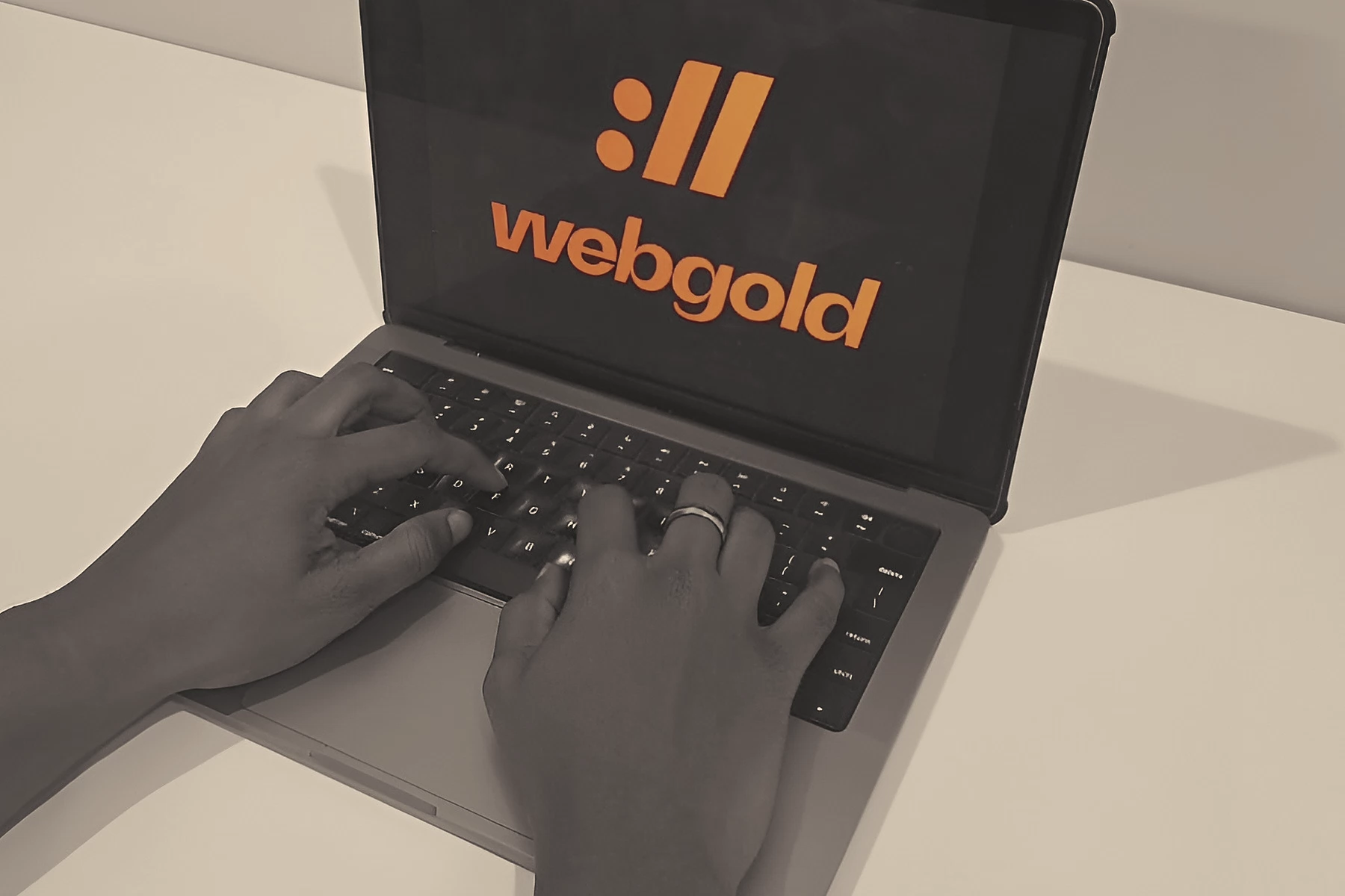
From 13 May 2026, Webgold’s LinkedIn, Linktree, and Google Business Profile carry a new logo, palette, and pair of typefaces. The rest of the brand follows in stages.
Webgold, the digital agency founded in Trinidad and Tobago in 2002, today began introducing a new brand identity. It appears first on the company’s LinkedIn, Linktree, and Google Business Profile, and reaches its other channels and materials in stages over the coming months.
The new identity is one visible part of a wider digital transformation under way inside the company. As AI reshapes the technology industry at speed, Webgold is enhancing its offerings, its operations, and its own team’s skills so that the look and the work move forward together.
What has changed
The identity has three parts.
- A redrawn logo, built as before on the
://that follows “http” in every web address. It comes in four colour variants and three layouts, so it holds its form on dark and light backgrounds and at every size, from a profile icon to a banner. - A palette of six colours, anchored by a warm near-black and a soft, warm off-white, with orange used sparingly as an accent rather than a fill, and gold and sand tones for depth.
- Two typefaces. Quanta Grotesk Pro sets headings and figures, and DM Sans sets everything meant to be read.
What stays the same
The change is to how Webgold looks. Its dedication to clients, its more than two decades of experience in the field, its client teams, and its existing agreements all stay as they are.
Clients and partners will see the new identity arrive on proposals, reports, and correspondence as each one is updated, rather than all at once.